The Engineering of CSS Containment
•11 min read•By Saman Kefayatpour
Sometimes, frontend development can seem straightforward from the outside—like we're just adjusting colors and alignments. But when we build large-scale applications with massive dashboards, independent widgets, or infinite feeds, managing how the browser renders our elements requires careful engineering.
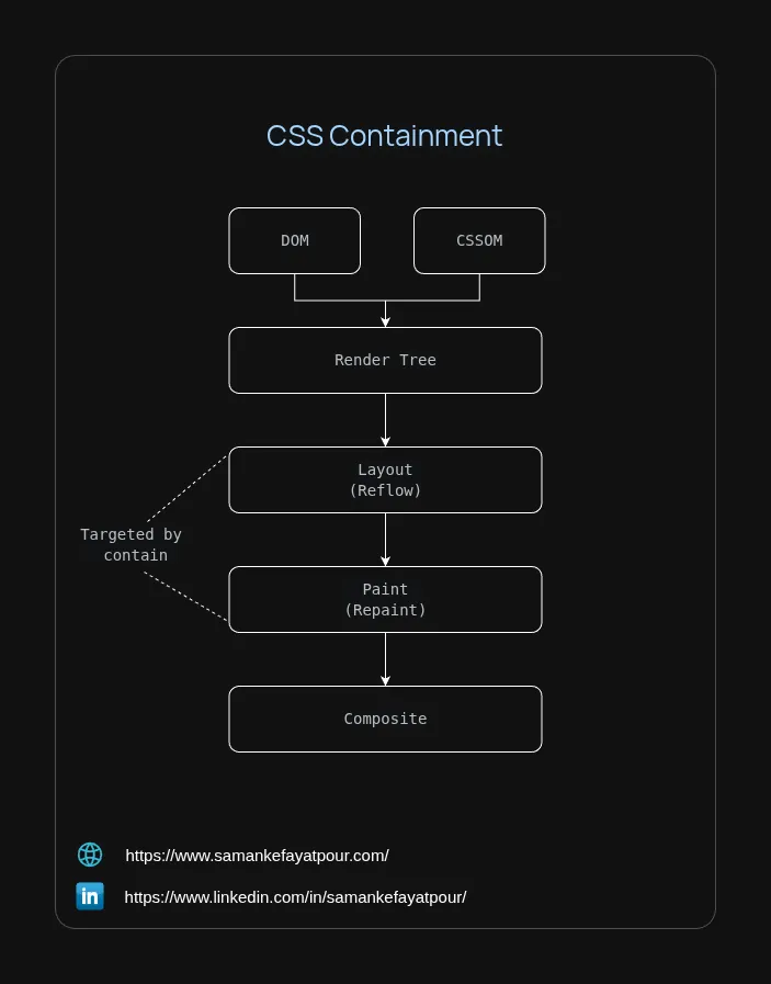
When a single element on a page updates, it can trigger a chain reaction of geometric recalculations that force the browser to check and re-evaluate other parts of the document. This sequence of steps is known as the Critical Rendering Path (CRP).
[ HTML ] ──> [  DOM  ] ──┐
                         ├──> [ Render Tree ] ──> [  Layout  ] ──> [  Paint  ] ──> [ Composite ]
[ CSS  ] ──> [ CSSOM ] ──┘                         (Reflow)        (Repaint)
                                                       │               │
                                                       └───────┬───────┘
                                                   [ Targeted by contain ]
Simplified Critical Rendering Path (CRP) diagram highlighting the containment boundaries.
To help us manage this pipeline, CSS provides a tool called the contain property. It allows us to tell the browser engine exactly where the boundaries of a component lie, so it can optimize how it handles layout and paint calculations.
To use containment effectively, we can look at the four distinct boundaries defined by the specification.
contain: layoutWhat it means: It isolates the element's internal layout geometry from the rest of the document.
By giving the element an independent formatting context, the browser knows that no matter how much the elements inside move, resize, or shift, they cannot alter the size or position of any element outside this box. During an update, the browser can safely skip recalculating the layout outside of this specific element.
Example: Imagine a dashboard hosting a third-party advertisement banner or an interactive widget. If the widget's internal contents dynamically expand or contract as live data streams in, the browser would normally recalculate the layout of the surrounding page elements. By applying layout containment, we ensure that any structural movement stays within that specific widget, protecting the rest of the application.
The Catch: Layout containment transforms the element into a positioning anchor. It creates a new containing block for both absolute and fixed descendants. If a child element has position: fixed, it will no longer align itself to the global browser window; instead, it hooks directly to the padding edge of this container. It also creates a new stacking context, meaning any internal z-index properties become completely localized to this element.
contain: paintWhat it means: It turns the element into a visual boundary, ensuring its descendants cannot display outside its edges.
The browser clips the rendered content directly to the element's padding box. Because the boundary is strictly clipped, the browser can skip the paint phase for all of its children entirely if the container moves completely off-screen.
Example: Consider building an infinite scroll feed or an off-canvas navigation drawer that holds hundreds of items. Even if these elements are visually hidden off-screen, the browser still expends energy verifying whether their pixels intersect the visible screen area during scroll updates. Using contain: paint signals to the browser that if the parent wrapper isn't visible, it can bypass generating paint commands for its children. This keeps the performance smooth without overusing memory.
The Catch: Like layout containment, applying paint containment creates a new stacking context, localizing internal z-index layers. Note that while contain: paint enables the browser to skip painting off-screen content, if you want to instruct the browser to skip both layout and paint work wholesale, you should look into a companion property like content-visibility: auto.
Note: If a component requires both layout and visual boundaries but its size remains dynamic, you can combine these primitives as a space-separated list: contain: layout paint;
contain: styleWhat it means: It restricts the scope of CSS features that can have page-wide side effects.
The engine traps the changes of properties that typically escape their immediate DOM tree—specifically CSS counters (counter-increment, counter-set) and quote strings (open-quote, close-quote).
Example: This is especially useful in modular setups where different teams build separate widgets for the same page. If a widget dynamically counts list entries using native CSS counters, that counter could accidentally bleed out and break the list numbering of the parent document. contain: style acts as a clean boundary that resets the counter context for that subtree.
The Catch: This does not stop standard styling properties like text color, typography fonts, or custom CSS variables from inheriting downward into the element. It strictly confines specific side-effect mechanisms like counters.
contain: size & inline-sizeWhat it means: It evaluates the container's layout dimensions completely independently of what is inside it.
Normally, even if we give an element a fixed width and height, the browser's layout engine still loops through all the children inside it during a reflow to calculate text wrapping, minimum width constraints, or overflow behavior. When we add contain: size, the browser completely skips this traversal. It calculates the container's layout footprint using only the container's own explicit style properties. The physical dimensions, text volume, or margins of the children contribute exactly zero to the parent's size calculation.
Example: Imagine we have a dynamic widget—like a live-updating stock chart—placed inside a flexible CSS Grid or Flexbox layout. Even if we've styled that widget with a fixed size, rapid data updates inside it can cause the browser to re-examine the subtree to ensure no layout lines are broken. By adding contain: size, the outer layout of our page can be calculated instantly because the browser knows nothing shifting inside that widget can ever ripple out to alter the surrounding layout flow.
The Catch: Because the engine ignores the children's dimensions during this check, an element with contain: size will instantly collapse to 0x0 pixels on both axes unless we explicitly assign it a specific width and height via CSS, or provide a placeholder. Setting a standard width and height tells the browser how big a box should look; adding contain: size tells the browser's engine to stop looking inside the box to calculate the overall page layout.
contain: layout isolates how internal layout changes are calculated, not the element's final physical footprint on the page.
When we apply contain: layout to a container, the browser assumes that nothing outside that element depends on the internal geometry of its descendants.
<div class="card">
  <div class="content">...</div>
</div>
.card {
  contain: layout;
}
When .content changes or shifts, the browser limits its layout re-evaluations purely inside the .card boundary, avoiding a full walkthrough of unrelated page elements like headers or sidebars.
Without Containment:                   With contain: layout:
Page                                   Page
├── Header                             ├── Header
├── Sidebar                            ├── Sidebar
├── Card                               └── Card [Layout Boundary]
│   ├── Child A                            ├── Child A
│   └── Child B                            └── Child B
└── Footer                             └── Footer
However, the parent element still needs to track how much space .card occupies. If we leave the height of .card auto-sized and its content grows, the card itself expands. Because the container's own physical dimensions altered, the layout engine must naturally push down any following elements, like a footer. The optimization is simply that the engine didn't have to look at the individual children inside the card to decide to move that footer; it only looked at the card's final outer edge.
If an element has fixed dimensions alongside layout containment, any internal child that exceeds those bounds will overflow visually without expanding the parent container or pushing sibling elements sideways.
+---------------------+
| Card (300px width)  |
|  +---------------+  |
|  | Content 600px |-----> Visual Overflow (Siblings remain unmoved)
|  +---------------+  |
+---------------------+
To stop the browser from responding to changes in the element's intrinsic size entirely, we must combine layout isolation with size isolation. This gives the browser an absolute guarantee that the contents can never alter the parent's footprint.
| Scenarios | contain: layout | contain: layout size |
|---|---|---|
| Child layout mutations | Confined strictly to the subtree | Confined strictly to the subtree |
| Element's own outer dimensions | Can fluidly expand based on content | Frozen (contents cannot dictate size) |
| Sibling elements pushed | Yes, if the container's size scales | No, layout footprint remains perfectly static |
| Visual overflow possible | Yes | Yes |
contain-intrinsic-sizeTo solve the layout collapse issue that happens with size containment, we can use a companion property called contain-intrinsic-size.
This property allows us to provide a placeholder size that the browser can use while the element's children are being bypassed for layout. By pairing our fallback values with the modern auto keyword, we tell the browser to use our placeholder initially, but then "remember" the actual rendered dimensions of our content once it loads. This prevents annoying layout shifts if the container goes off-screen and returns later:
.card-placeholder {
  contain: size;
  /* Uses 300x200px initially, then remembers the exact rendered dimensions */
  contain-intrinsic-size: auto 300px auto 200px;
}
By defining an intrinsic placeholder, we give the browser an explicit fallback size. This keeps our layout stable and predictable before our data fully loads or while the element is computed in isolation.
The layout collapse aspect of contain: size is also why the specification introduced the inline-size primitive. Instead of blocking dimension calculations on both axes, inline-size isolates sizing only along the inline axis—which corresponds to the width in standard horizontal writing modes. This optimization forms the foundation of modern Container Queries (@container).
When we design responsive components, we often want them to alter their layout based on the physical width of their immediate container rather than the entire browser viewport. However, this creates a challenge for the browser engine: if a component changes the layout of its children based on its own width, those children might push the container's edges out, altering its width again and creating an infinite loop.
To prevent this loop, the browser must guarantee that styling children cannot change the width of the container itself. This is why setting container-type: inline-size implicitly activates contain: inline-size layout style under the hood. It locks down the inline axis width, isolates the layout tree, and encapsulates style counters all at once so the browser can calculate the component's internal responsive styles safely.
While we can mix and match primitives, you will frequently see two pre-defined shorthand values used in production.
contain: contentlayout paint stylecontain: strictlayout paint style sizesize, it completely decouples the element from the browser's global rendering loop. It offers the highest performance gains, but requires us to manage the container's dimensions explicitly or use contain-intrinsic-size.Here is how we can implement this practice to safeguard our page layouts from a volatile chart widget:
<!-- The outer grid remains fluid, responsive, and fast -->
<div class="dashboard-grid">
  <div class="analytics-container">
    <!-- Fast-updating live charts or data grids go here -->
    <canvas id="liveStockChart"></canvas>
  </div>
</div>
.analytics-container {
  contain: strict; /* Fully isolates size, layout, paint, and style */
  contain-intrinsic-size: auto 400px; /* Provides a layout footprint buffer */
  width: 100%;
}
| Containment Shortcut | Primitives Active | Performance Mechanism | Primary Use Case |
|---|---|---|---|
contain: layout | layout | Avoids global page reflows by creating a localized formatting context and a new stacking context. | Isolating third-party scripts, advertisements, or volatile DOM subtrees. |
contain: paint | paint | Enables the browser to skip paint calculations for child elements when the parent is off-screen. | Infinite scroll elements, virtualized feeds, and hidden side drawers. |
contain: style | style | Limits the impact of CSS counters and open/close quote strings to the subtree. | Protecting global counter integrity inside modular dashboard architectures. |
contain: size | size | Calculates the layout footprint using only the container's styles, skipping child dimensions entirely. | Dynamic widgets (like charts or grids) nested inside flexible grid or flexbox layouts. |
contain: content | layout paint style | Combines layout, paint, and style boundaries to optimize components while letting size remain dynamic. | General purpose optimization for standard responsive UI elements and cards. |
contain: strict | layout paint style size | Provides full rendering isolation across layout, paint, style, and size constraints. | Fixed-dimension components, video players, or elements using contain-intrinsic-size placeholders. |
Building efficient frontend architectures is often about working in harmony with the browser's native capabilities. Understanding CSS containment shows us that styling at scale is a thoughtful discipline of layout systems. By setting up these clear boundaries, we can help the browser optimize its rendering routines, ensuring our applications remain fast and reliable for our users.
As always, I may miss some points, so if you have any questions or suggestions, please feel free to share them with me. If you know a better approach, I’d love to hear about it. I’m always open to learning and improving my knowledge.
Stay humble and keep learning!